The checkout that asked for less

The hypothesis
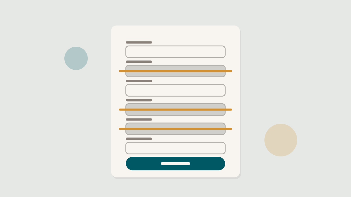
The shop’s checkout had grown the way most do: one reasonable request at a time. A phone number for the courier. A second address line. A date of birth that marketing wanted for a birthday email. And, at the very start, a screen asking every customer to create an account before they could pay.
The team’s hypothesis was simple. Every field is a small cost, the account wall is a large one, and customers who are ready to buy should be allowed to finish. They would cut the checkout from three pages to two, drop four fields and move account creation to after the order was placed.
The first two weeks
The early read was disappointing. Completed orders in the test group were up, but only slightly, and well inside the noise. Average order value was flat. The product manager was ready to call it.
What changed the conversation was segmenting by device. On desktop, nothing had moved. On mobile, the share of shoppers who reached the payment step rose sharply, and the orders followed a week later, as returning visitors who had abandoned before came back and finished.
The test was right. We were just reading it on the wrong screen and in the wrong week.
What actually mattered
The account wall turned out to be most of the effect. Removing fields helped at the margin, but the single biggest drop in the old funnel had always been the first screen, where a customer with a full cart was asked for a password. Moved to the confirmation page, as an offer to save the details they had just typed, account creation rose too: people were happy to keep an account once they had a reason to.
The birthday field went and has not come back. Nobody missed it.
What to take from it
Field tests rarely produce a clean headline in week one. Decide your segments before launch, run for at least two full purchase cycles, and look at the step where customers leave rather than only the final count. A checkout is a sequence, and it fails one screen at a time.
Keep reading
View all
For pitches, data you would like us to look at and letters to the editor, write to us any time. We read everything.
Free. One study, one teardown and one thing to test, every Tuesday morning. Nothing else.